ListingToolbar component
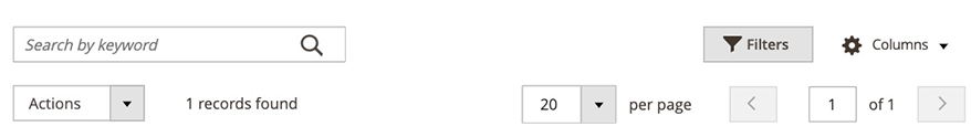
The ListingToolbar component implements a container for the listing-related elements such as paging, mass actions, filters, and bookmarks. It aggregates all elements that serve as tools and renders them at the top of the main table.
Configuration options
| Option | Description | Type | Default |
|---|---|---|---|
sticky |
Whether the toolbar has a fixed position. When set to true, elements like paging, filters, and table headers stay in the viewport’s area, no matter where the scroll position is. |
Boolean |
false |
stickyClass |
A list of additional CSS classes added to the root node of the .html template specified in StickyTmpl. |
{ [name:string]: boolean } |
{'sticky-header': true} |
stickyTmpl |
Path to the toolbar’s template for the fixed position. | String |
ui/grid/sticky/sticky |
template |
Path to the component’s .html template. |
String |
ui/grid/toolbar |
Examples
Integrate the ListingToolbar component with the Listing component
In the following example, we group the following components:
- Bookmark
- ColumnsControls
- FilterSearch
- Filters
- Mass Actions
- Paging
1
2
3
4
5
6
7
8
9
10
11
12
13
14
15
<listingToolbar name="listing_top">
    <settings>
        <sticky>true</sticky>
    </settings>
    <bookmark name="bookmarks"/>
    <columnsControls name="columns_controls"/>
    <filterSearch name="fulltext"/>
    <filters name="listing_filters">
        ...
    </filters>
    <massaction name="listing_massaction">
        ...
    </massaction>
    <paging name="listing_paging"/>
</listingToolbar>
Result
Source files
Extends UiCollection: