SelectColumn component
The SelectColumn component receives an array of values and displays the column with corresponding labels. The value-label correspondence is set in the component’s configuration.
Configuration options
| Option | Description | Type | Default |
|---|---|---|---|
component |
The path to the component’s .js file in terms of RequireJS. |
String | Magento_Ui/js/grid/columns/select |
filter |
Reference to one of the available filter types defined in the Filters component. If the value represents an object containing the filterType field, this object is considered as an extension of the referenced filter element. If there is no such field in the value object, it is considered as a definition of a custom filter element. |
String | Object | - |
label |
The column label displayed in the header. | String | '' |
options |
An array of objects used to display a field’s content by matching the associated record’s value with the value of one of the elements provided in options. |
Array | [] |
visible |
Initial component’s visibility. When set to false, the display: none CSS style is added to the component’s DOM block. |
Boolean | true |
Option interface
| Option | Description | Type | Required |
|---|---|---|---|
value |
Option’s identifier or an array of options. | String | Number | Array<Option> | Required |
label |
Label to be displayed in a column’s field. | String | Required |
Source files
Extends Column:
Examples
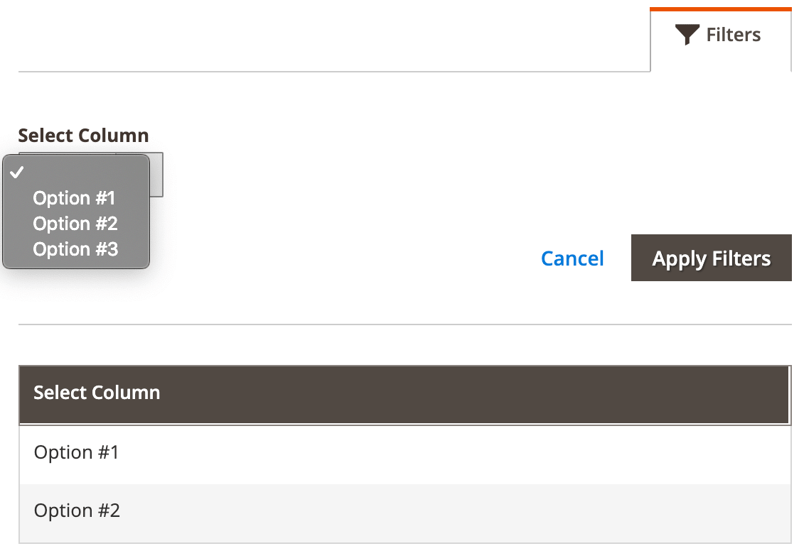
Integrate the SelectColumn component with the Listing component
This is an example of how the SelectColumn component integrates with the Listing component:
1
2
3
4
5
6
7
8
9
10
11
12
13
14
15
16
17
18
19
20
21
22
23
24
25
26
27
28
29
<listing>
    <listingToolbar name="listing_top">
        <filters name="listing_filters"/>
    </listingToolbar>
    <columns>
        <column name="select_column_example" component="Magento_Ui/js/grid/columns/select">
            <settings>
                <filter>select</filter>
                <dataType>select</dataType>
                <label translate="true">Select Column</label>
                <visible>true</visible>
                <options>
                    <option name="0" xsi:type="array">
                        <item name="value" xsi:type="number">1</item>
                        <item name="label" xsi:type="string" translate="true">Option #1</item>
                    </option>
                    <option name="1" xsi:type="array">
                        <item name="value" xsi:type="number">2</item>
                        <item name="label" xsi:type="string" translate="true">Option #2</item>
                    </option>
                    <option name="2" xsi:type="array">
                        <item name="value" xsi:type="number">3</item>
                        <item name="label" xsi:type="string" translate="true">Option #3</item>
                    </option>
                </options>
            </settings>
        </column>
    </columns>
</listing>
Result