Expandable Column component
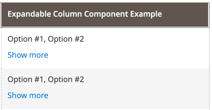
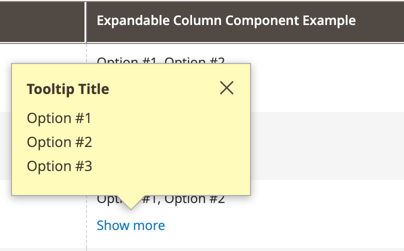
The Expandable Column UI component is an extension for Column. It alphabetically sorts the options associated with a record/row and renders several options (the number is defined in configuration) into a cell. The full list of options is displayed in a tooltip implemented by the Tooltip UI component <Magento_Ui_module_dir>/view/base/web/js/lib/knockout/bindings/tooltip.js.
The Expandable Column component can be used in Admin and the storefront.
Configuration options
| Option | Description | Type | Default |
|---|---|---|---|
bodyTmpl |
Path to the template used for rendering the column’s fields in the table’s body. | String | ui/grid/cells/expandable |
component |
The path to the component’s .js file in terms of RequireJS. |
String | Magento_Ui/js/grid/columns/expandable |
tooltipTitle |
A title for the tooltip. | String | '' |
tooltipTmpl |
Path to the template used for rendering the component’s tooltip content template. | String | ui/grid/cells/expandable/content |
visibeItemsLimit |
A number of options to display in a cell. | String | 5 |
Examples
Integrate the Expandable component with the Listing component
The following example shows how the Expandable component integrates with the Listing component:
The component’s options are set in the configuration .xml file as follows:
1
2
3
4
5
6
7
8
9
10
11
12
13
14
15
16
17
18
19
20
21
22
23
24
25
26
27
28
29
30
31
32
<listing>
    ...
    <columns>
        ...
        <column name="labels" class="Magento\Ui\Component\MassAction\Columns\Column">
            <argument name="data" xsi:type="array">
                <item name="config" xsi:type="array">
                    <item name="component" xsi:type="string">Magento_Ui/js/grid/columns/expandable</item>
                    <item name="tooltipTitle" xsi:type="string">Tooltip Title</item>
                    <item name="visibeItemsLimit" xsi:type="number">2</item>
                    <item name="options" xsi:type="array">
                        <item name="0" xsi:type="array">
                            <item name="value" xsi:type="number">1</item>
                            <item name="label" xsi:type="string" translate="true">Option #1</item>
                        </item>
                        <item name="1" xsi:type="array">
                            <item name="value" xsi:type="number">2</item>
                            <item name="label" xsi:type="string" translate="true">Option #2</item>
                        </item>
                        <item name="2" xsi:type="array">
                            <item name="value" xsi:type="number">3</item>
                            <item name="label" xsi:type="string" translate="true">Option #3</item>
                        </item>
                    </item>
                </item>
            </argument>
            <settings>
                <label translate="true">Expandable Column Component Example</label>
            </settings>
        </column>
    </columns>
</listing>
Result
Dependencies
This component has a dependency on the Column component, <Magento_Ui_module_dir>/view/base/web/js/grid/columns/column.js.
Source files
<Magento_Ui_module_dir>/view/base/web/js/grid/columns/expandable.js<Magento_Ui_module_dir>/view/base/web/templates/grid/cells/expandable.html<Magento_Ui_module_dir>/view/base/web/templates/grid/cells/expandable/content.html
Methods and events
The following API methods are available:
getFullLabel()- gets a label from a full list of options.getShortLabel()- gets a label from a list of options limited byvisibeItemsLimitvalue.getLabelsArray()- extracts an array of labels associated with provided values and sorts these labels alphabetically.isExpandable()- checks if the amount of options associated with a record is greater than avisibeItemsLimitvalue.flatOptions()- transforms the tree options structure to a linear array.