ColorPicker component
The ColorPicker component uses the Spectrum and tinycolor.js libraries to make it easier to choose and implement color values. The ColorPicker component must be a child of the Listing or Form components.
Configuration options
| Option | Description | Type | Default Value |
|---|---|---|---|
colorFormat |
Defines the color format displayed in the selection tool and input field. Valid formats: hex, rgb, hsl, hsv, name, none |
string |
- |
colorPickerMode |
Defines the mode that affects the available color picker functionality. Valid modes: simple, full, noalpha, palette |
string |
- |
elementTmpl |
The path to the .html template of the particular field type (color-picker). |
string |
ui/form/element/color-picker |
label |
Option’s label. | string |
- |
Sources files
- app/code/Magento/Ui/view/base/ui_component/etc/definition/colorPicker.xsd
- app/code/Magento/Ui/view/base/web/js/form/element/colorPicker.js
- app/code/Magento/Ui/view/base/web/js/lib/knockout/bindings/colorPicker.js
- app/code/Magento/Ui/view/base/web/templates/form/element/colorPicker.html
- lib/web/jquery/spectrum/spectrum.js
- lib/web/jquery/spectrum/tinycolor.js
Examples
1
2
3
4
5
6
7
8
9
10
11
12
13
<form>
...
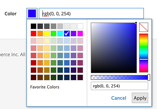
<colorPicker name="colors_filter" class="Magento\Ui\Component\Form\Element\ColorPicker" component="Magento_Ui/js/form/element/color-picker">
<settings>
<label translate="true">Color</label>
<elementTmpl>ui/form/element/color-picker</elementTmpl>
<colorFormat>rgb</colorFormat>
<colorPickerMode>full</colorPickerMode>
<dataScope>colors_filter</dataScope>
</settings>
</colorPicker>
...
</form>
Result