DragAndDrop component
The DragAndDrop component is an extension for Columns, allowing users to change columns position in the table.
Configuration options
| Option | Description | Type | Default Value |
|---|---|---|---|
enabled |
Whether the component is allowed to change the position of columns. | Boolean | true |
fixedX |
Whether the column has a fixed position on the X-axis. That is, whether it can be moved horizontally. | Boolean | false |
fixedY |
Whether the column has a fixed position on the Y-axis. That is, whether it can be moved vertically. | Boolean | true |
noSelectClass |
CSS class applied to the table when one of its columns is being dragged. | String | '_no-select' |
Source files
Extends UiCollection:
Examples
Integrate the DragAndDrop component with the Listing component
This example configures the DragAndDrop component for the Columns component and integrates it with the Listing component:
1
2
3
4
5
6
7
8
9
10
11
12
13
14
<listing>
    ...
    <columns>
        <settings>
            <dndConfig>
                <param name="enabled" xsi:type="boolean">true</param>
                <param name="fixedX" xsi:type="boolean">false</param>
                <param name="fixedY" xsi:type="boolean">true</param>
                <param name="noSelectClass" xsi:type="string">_no-select</param>
            </dndConfig>
        </settings>
        ...
    </columns>
</listing>
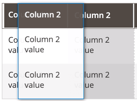
Result
Disable the DragAndDrop component for the Columns component
This example disables the DragAndDrop component for the Columns component and integrates it with the Listing component:
1
2
3
4
5
6
7
8
9
10
11
<listing>
    ...
    <columns>
        <settings>
            <dndConfig>
                <param name="enabled" xsi:type="boolean">false</param>
            </dndConfig>
        </settings>
        ...
    </columns>
</listing>