Checkbox component
The Checkbox component implements a form field that is an HTML <input type="checkbox"> element. It can also be displayed as a “toggle” handler or a radio button element.
Configuration options
| Option | Description | Type | Default |
|---|---|---|---|
checked |
Initial checkbox state (selected or cleared). If false, the checkbox is cleared. If true, the checkbox is selected. |
Boolean | false |
component |
The path to the component’s .js file in terms of RequireJS. |
String | Magento_Ui/js/form/element/single-checkbox |
label |
Label to be displayed in the field. | String | '' |
multiple |
Renders multiple elements. | Boolean | false |
prefer |
The input type of the element to be rendered. Can be either radio button, checkbox, or toggle key. Changing this value also changes the elementTmpl, originally defined in the parent (abstract) component. |
String (radio | checkbox | toggle) |
checkbox |
template |
The path to the component’s .html template. |
String | ui/form/field |
templates |
Paths to templates for all possible types of input elements. The exact template to be used for rendering is defined by the prefer property. |
Object | {radio: 'ui/form/components/single/radio', checkbox: 'ui/form/components/single/checkbox', toggle: 'ui/form/components/single/switcher'} |
valueMap |
Convert the component’s value to the expected type. For example, you can set to convert ‘0’ to ‘false’, this would look like following: {'0': false} |
Object | {} |
Source files
Extends Abstract:
- app/code/Magento/Ui/view/base/web/js/form/element/single-checkbox.js
- app/code/Magento/Ui/view/base/web/templates/form/components/single/checkbox.html
- app/code/Magento/Ui/view/base/web/templates/form/components/single/radio.html
- app/code/Magento/Ui/view/base/web/templates/form/components/single/switcher.html
- app/code/Magento/Ui/view/base/web/templates/form/field.html
Examples
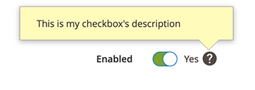
Integrate the Checkbox component configured as toggle element with the Form component
This example integrates the Checkbox component configured as a toggle element with the Form component:
1
2
3
4
5
6
7
8
9
10
11
12
13
14
15
16
17
18
19
20
21
22
23
<form>
    <fieldset>
        <field name="myCheckbox" formElement="checkbox">
            <settings>
                <label translate="true">Enabled</label>
                <tooltip>
                    <description translate="true">This is my checkbox's description</description>
                </tooltip>
            </settings>
            <formElements>
                <checkbox>
                    <settings>
                        <prefer>toggle</prefer>
                        <valueMap>
                            <map name="false" xsi:type="boolean">false</map>
                            <map name="true" xsi:type="boolean">true</map>
                        </valueMap>
                    </settings>
                </checkbox>
            </formElements>
        </field>
    </fieldset>
</form>
Result
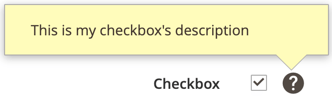
Integrate the Checkbox component configured as checkbox element with the Form component
This example integrates the Checkbox component configured as a checkbox element with the Form component:
1
2
3
4
5
6
7
8
9
10
11
12
13
14
15
16
17
18
19
20
21
22
23
<form>
    <fieldset>
        <field name="myCheckbox" formElement="checkbox">
            <settings>
                <label translate="true">Checkbox</label>
                <tooltip>
                    <description translate="true">This is my checkbox's description</description>
                </tooltip>
            </settings>
            <formElements>
                <checkbox>
                    <settings>
                        <prefer>checkbox</prefer>
                        <valueMap>
                            <map name="false" xsi:type="boolean">false</map>
                            <map name="true" xsi:type="boolean">true</map>
                        </valueMap>
                    </settings>
                </checkbox>
            </formElements>
        </field>
    </fieldset>
</form>
Result
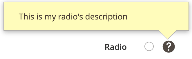
Integrate the Checkbox component configured as radio element with the Form component
This example integrates the Checkbox component configured as a radio element with the Form component:
1
2
3
4
5
6
7
8
9
10
11
12
13
14
15
16
17
18
19
20
21
22
23
<form>
    <fieldset>
        <field name="myRadio" formElement="checkbox">
            <settings>
                <label translate="true">Radio</label>
                <tooltip>
                    <description translate="true">This is my radio's description</description>
                </tooltip>
            </settings>
            <formElements>
                <checkbox>
                    <settings>
                        <prefer>radio</prefer>
                        <valueMap>
                            <map name="false" xsi:type="boolean">false</map>
                            <map name="true" xsi:type="boolean">true</map>
                        </valueMap>
                    </settings>
                </checkbox>
            </formElements>
        </field>
    </fieldset>
</form>
Result