Filters component
The Filters component renders UI controls for filtering and applies filtering. Must be a child of the Listing component.
See the Admin Design Pattern Library (Filters) topic for information about the UI design patterns that can be implemented using Filters component.
Configuration options
| Option | Description | Type | Default Value |
|---|---|---|---|
component |
The path to the component’s .js file in terms of RequireJS. |
String | '' |
chipsConfig |
Configuration passed to the FiltersChips component. |
Object | { name: '${ $.name }_chips', provider: '${ $.chipsConfig.name }', component: 'Magento_Ui/js/grid/filters/chips'} |
statefull |
Defines a list of component properties whose values are automatically saved in the configured storage if they change. key is the property’s name and the value defines whether its saved. |
Object | {applied: true} |
stickyTmpl |
Additional .html template that displays filters when the Toolbar component gets a fixed position. |
String | ui/grid/sticky/filters |
template |
Path to the component’s .html template. |
String | ui/grid/filters/filters |
templates.filters |
Describes basic filter types. This definitions are used to dynamically create filter elements based on the filter field specified in the corresponding column. For example, if a column’s filter property contains the text value, then a Filter component instance with a definition for the text type will be created. |
Object | Contains definitions of the text, select,dateRange and textRange filter types. |
Source files
Extends uiCollection:
- app/code/Magento/Ui/view/base/web/js/grid/filters/filters.js
- app/code/Magento/Ui/view/base/web/templates/grid/sticky/filters.html
- app/code/Magento/Ui/view/base/web/templates/grid/filters/filters.html
Examples
Add a new filterable customer attribute
To add a new customer attribute to the customer grid and make it filterable, follow these steps:
- Create
view/adminhtml/ui_component/customer_listing.xmlto add a column component. - Create the column component PHP class which extends
Magento\Ui\Component\Listing\Columns\Column. - Create
etc/indexer.xmlto add the attribute to thecustomer_gridindex and define it as filterable. - Set
is_used_in_gridtotruefor the attribute.
Integrate the Filters component with the Listing component
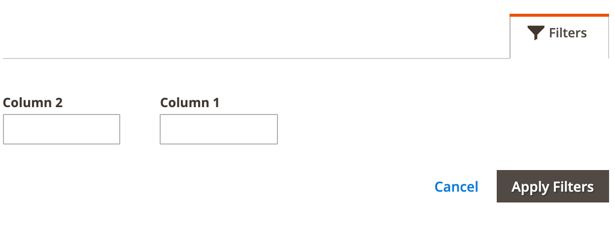
This example integrates the Filters component with the Listing component:
1
2
3
4
5
6
7
8
9
10
11
12
13
14
15
16
17
18
19
20
21
22
23
24
25
26
<listing>
    ...
    <listingToolbar>
        <!-- integrates the Filters component -->
        <filters name="listing_filters" />
    </listingToolbar>
    <!-- add columns -->
    <columns name="columns_example">
        <column name="column1" sortOrder="10">
            <settings>
                <filter>text</filter>
                <dataType>text</dataType>
                <label translate="true">Column 1</label>
                <default>1</default>
            </settings>
        </column>
        <column name="column2" sortOrder="13">
            <settings>
                <filter>text</filter>
                <dataType>text</dataType>
                <label translate="true">Column 2</label>
                <default>2</default>
            </settings>
        </column>
    </columns>
</listing>
Result