Tabs widget
The Magento tabs widget implements single content area with multiple panels, each associated with a header in a list. It uses the Magento collapsible widget.
The tabs widget source is lib/web/mage/tabs.js.
Initialize the tabs widget
For information about how to initialize a widget in a JS component or .phtml template, see the Initialize JavaScript topic.
Generally the tabs widget is instantiated like following:
1
$("#element").tabs();
Where:
#elementis the selector of the element for tabs is initialized.
The following example shows a PHTML file using the script:
1
2
3
4
5
6
7
<script>
    require([
        'jquery',
        'tabs'], function ($) {
        $("#element").tabs();
    });
</script>
Options
The tabs widget has the following options:
- active
- ajaxUrlElement
- ajaxContent
- animate
- closedState
- collapsible
- collapsibleElement
- content
- disabled
- disabledState
- header
- icons
- loadingClass
- openedState
- openOnFocus
- saveState
- trigger
active
Index of the tab, which is active at the moment of initialization. Starts from “0”
Type: Number
Default value: 0
ajaxUrlElement
Selector for the tab element, which contains the URL for the Ajax request. The option of the collapsible widget used by tabs.
Type: String
Default value: [data-ajax=true]
ajaxContent
Defines if the content is loaded by Ajax request. The option of the collapsible widget used by tabs.
Type: Boolean
Default value: false
animate
Specifies if the collapse/expand actions are performed with animation. The option of the collapsible widget used by tabs.
Type: Multiple types are supported:
- Boolean: the
falsevalue disables the animation - Number: duration in milliseconds
- String: is parsed to an object as a json string
- Object:
1
2
3
4
5
{
    duration: <Number>,
    easing: <String>,
    <propToAnimate>: <howToAnimate>
}
For details about the object passed, see jQuery.animate().
Default value: false
closedState
Class assigned to the tab being closed.
Type: String
Default value: null
collapsible
If this option is set to false, the content is not collapsed when the panel is active. The option of the collapsible widget used by tabs.
Type: Boolean
Default value: false
collapsibleElement
Selector of the element for which the collapsible widget is initialized.
Type: String
Default value: [data-role=collapsible]
content
Selector for the content element, searched for using .find() on the main collapsible element. The option of the collapsible widget used by tabs.
Type: String
Default value: [data-role=content]
disabled
Array of the elements’ indexes which are disabled when the widget is initialized.
Type: Array of numbers.
Default value: []
disabledState
Class assigned to the tab being currently disabled.
Type: String
Default value: null
header
Selector for the header element, searched for using .find() on the main collapsible element.
The option of the collapsible widget used by tabs.
Type: String
Default value: [data-role=title]
icons
The classes for icons to be used in headers. If no classes are specified, icons are not be created. A new span is created and appended to the header, the classes for this span are automatically changed whenever the content gets expanded/collapsed. The option of the collapsible widget used by tabs.
Type: String
Default value: { header: null, activeHeader: null }
loadingClass
Class assigned to a tab during content loading for this tab.
Type: String
Default value: null
openedState
Class name assigned to a tab which is being currently opened.
Type: String
Default value: null
openOnFocus
Used for setting keyboard navigation. Defines if the tab is expanded when its header is in focus.
Type: Boolean
Default value: true
saveState
Specifies if the state is saved in the local storage if the browser supports it. Otherwise will be saved into a cookie. The option of the collapsible widget used by tabs.
Type: Boolean
Default value: true
trigger
Selector for the trigger element, applied using .find() on the main collapsible element. If the trigger is not found, the header becomes a trigger.
The option of the collapsible widget used by tabs.
Type:
- String
- jQuery object
Default value: [data-role=trigger]
Methods
The tabs widget has the following methods:
activate()
activate(index) displays content for the tab with the corresponding index.
enable()
enable(index) enables the tab with the corresponding index.
deactivate()
deactivate(index) hides content for the tab with the corresponding index.
disable()
disable(index) disables the tab with the corresponding index.
Events
Tabs is subscribed to the same events as the collapsible widget:
beforeOpen callback
Called before the content is opened.
Example of adding a callback to beforeOpen events:
1
2
3
$("#element").on("beforeOpen", function () {
    // do something before opening the content
});
dimensionsChanged
Called after content is opened or closed.
Example of adding a callback to dimensionsChanged events:
1
2
3
4
5
6
7
8
9
10
$("#element").on("dimensionsChanged", function (event, data) {
    var opened = data.opened;

    if (opened) {
        // do something when the content is opened
        return;
    }

    // do something when the content is closed
});
Code sample
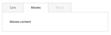
The following example shows how to initialize the tabs widget and pass options during the initialization. This example uses the same CSS classes as the tabs on the product page.
1
2
3
4
5
6
7
8
9
10
11
12
13
14
15
16
17
<div class="product data items"
     data-mage-init='{"mage/tabs": {"openedState": "active", "animate": {"duration": 100}, "active": 1, "disabled": [2], "disabledState": "disabled"}}'>
    <div class="item title" data-role="collapsible">
        <a class="switch" data-toggle="trigger" href="#tab-cars">Cars</a>
    </div>
    <div id="tab-cars" class="item content" data-role="content">Cars content</div>

    <div class="item title" data-role="collapsible">
        <a class="switch" data-toggle="trigger" href="#tab-movies">Movies</a>
    </div>
    <div id="tab-movies" class="item content" data-role="content">Movies content</div>

    <div class="item title" data-role="collapsible">
        <a class="switch" data-toggle="trigger" href="#tab-music">Music</a>
    </div>
    <div id="tab-music" class="item content" data-role="content">Music Content</div>
</div>
Result
The result is three tabs with content, where the last tab is disabled based on initialization options, as shown here: