Collapsible widget
The Magento collapsible widget converts a header/content pair into an accordion, where the content is collapsed or expanded on the header click.
Unlike the accordion widget which is initialized for a set of title/contents pairs, the collapsible widget is initialized for one title/content pair.
To “bind” several instances of a collapsible widget, the collateral option is used.
Once it is expanded, the content can be updated using Ajax. The collapsed/expanded state can be saved into local storage, or cookies if the browser does not support local storage.
The collapsible widget source is lib/web/mage/collapsible.js.
Initialize collapsible in JS
Generally the collapsible widget is instantiated like following:
1
$("#element").collapsible();
Where #element is the element’s selector.
If you need to be able to save the expanded/collapsed state, the element must have the id attribute specified.
The element’s id is also used in deep linking: if the id of the content or the id of the element that appends the content is specified as an anchor, the content for that element is automatically expanded.
Similar to the accordion widget, the header, title and content for collapsible can be defined by the child elements’ attributes or passed as widget options. See Accordion widget initialization for details.
Initialize collapsible with header only
You can initialize the collapsible widget without having a container that consists of a header and a content. In this case the initialization is made on the header:
1
$("#header").collapsible();
Initialize collapsible in a template
The collapsible widget can be initialized using the data-mage-init attribute or <script> tag, as described in JavaScript initialization.
Options
The collapsible widget has the following options:
- active
- ajaxUrlElement
- ajaxContent
- animate
- collapsible
- collateral
- content
- closedState
- disabled
- disabledState
- header
- icons
- loadingClass
- openedState
- saveState
- trigger
active
Specifies if the content should be expanded when the widget gets initialized.
Type: Boolean
Default value: false
Initialize the collapsible with the active option specified:
1
$("#element").collapsible({ active: true});
Get or set the active option, after initialization:
1
2
3
4
5
//getter
var active = $("#element").collapsible("option","active");

//setter
$("#element").collapsible("option","active",false);
ajaxUrlElement
Selector applied on the header using .find(), for the element that contains the URL for Ajax request.
Type: String
Default value: [data-ajax=true]
ajaxContent
Specifies if the content is updated using Ajax request.
Type: Boolean
Default value: false
animate
Specifies if the collapse/expand actions are performed with animation.
Type: Multiple types are supported:
- Boolean: the
falsevalue disables the animation - Number: duration in milliseconds
- String: is parsed to an object as a json string
-
Object: For details about the object passed, see jQuery.animate().
1
2
3
4
5
     {
        duration: <Number>,
        easing: <String>,
        <propToAnimate>: <howToAnimate>
     }
Default value: false
Initialize the collapsible with the animate option specified:
1
2
$("#element").collapsible({ animate: 1000});
$("#element").collapsible({ animate: {duration:1000,easing:"easeOutCubic"});
Get or set the animate option, after initialization:
1
2
3
4
5
//getter
var animate = $("#element").collapsible("option","animate");

//setter
$("#element").collapsible("option","animate",false);
collapsible
If this option is set to false, the content is not collapsed when the panel is active.
Type: Boolean
Default value: true
Initialize the collapsible widget with the collapsible option specified:
1
$("#element").collapsible({ collapsible: true});
Get or set the collapsible option after initialization:
1
2
3
4
5
//getter
var collapsible = $("#element").collapsible("option","collapsible");

//setter
$("#element").collapsible("option","collapsible",false);
collateral
Specifies the element, and the class which is assigned to this element, when the current element is opened; and is removed when the current element is closed.
An object that contains the following:
element: an element, can be a selector or jQuery object.openedState: the class name which is assigned to the element when the current element is in opened; removed when the current element is closed.
Type: String
Default value:
1
2
3
4
{
    element: null,
    openedState: null
}
content
Selector for the content element, searched for using .find() on the main collapsible element.
Type:
- String
- jQuery Object
Default value: [data-role=content]
Initialize the collapsible with the content option specified:
1
$("#element").collapsible({ content: ".content"});
Get or set the content option, after initialization:
1
2
3
4
5
//getter
var content = $("#element").collapsible("option","content");

//setter
$("#element").collapsible("option","content",".content");
closedState
Specifies the class that is assigned to the main collapsible element, when the content gets collapsed.
Type: String
Default value: null
Initialize the collapsible widget with the closedState option specified:
1
$("#element").collapsible({ closedState: "collapsible-content"});
Get or set the contentClass option after initialization:
1
2
3
4
5
//getter
var contentClass = $("#element").collapsible("option","contentClass");

//setter
$("#element").collapsible("option","contentClass","collapsible-content");
disabled
Specifies if the content should be disabled, when the widget gets initialized.
Type: Boolean
Default value: false
Initialize the collapsible widget with the disabled option specified:
1
$("#element").collapsible({ disabled: true});
Get or set the disabled option after initialization:
1
2
3
4
5
//getter
var disabled = $("#element").collapsible("option","disabled");

//setter
$("#element").collapsible("option","disabled",false);
disabledState
Specifies the class that is assigned to the main collapsible element when a panel gets disabled.
Type: String
Default value: null
Initialize the collapsible with the disabledState option specified:
1
$("#element").collapsible({ disabledState: "disabled"});
Get or set the disabledState option after initialization:
1
2
3
4
5
//getter
var disabledState = $("#element").collapsible("option","disabledState");

//setter
$("#element").collapsible("option","disabledState","disabled");
header
Selector for the header element, searched for using .find() on the main collapsible element. If the element with the specified selector is not found on the main collapsible element, the main element becomes a header.
Type:
- String
- jQuery Object
Default value: [data-role=title]
Initialize the collapsible with the content option specified:
1
$("#element").collapsible({ header: ".header"});
Get or set the header option, after initialization:
1
2
3
4
5
//getter
var header = $("#element").collapsible("option","header");

//setter
$("#element").collapsible("option","header",".header");
icons
The classes for icons to be used in headers. If no classes are specified, icons are not be created. A new span is created and appended to the header, the classes for this span are automatically changed whenever the content gets expanded/collapsed.
Type: String
Default value: { activeHeader: null, header: null }
Initialize the collapsible with the icons option specified:
1
$("#element").collapsible({ icons: {"header": "plus", "activeHeader": "minus"}});
Get or set the icons option, after initialization:
1
2
3
4
5
//getter
var icons = $("#element").collapsible("option","icons");

//setter
$("#element").collapsible("option","icons",{"header": "plus", "activeHeader": "minus" });
loadingClass
Specifies the class that is assigned to the main collapsible element when requesting data using Ajax.
Type: String
Default value: null
Initialize the collapsible with the loadingClass option specified:
1
$("#element").collapsible({ loadingClass: "loading"});
Get or set the loadingClass option after initialization:
1
2
3
4
5
//getter
var loadingClass = $("#element").collapsible("option","loadingClass");

//setter
$("#element").collapsible("option","loadingClass","loading");
Initialize the collapsible with the loadingClass option specified:
1
$("#element").collapsible({ loadingClass: ".ajax"});
Get or set the loadingClass option, after initialization:
1
2
3
4
5
//getter
var content = $("#element").collapsible("option","loadingClass");

//setter
$("#element").collapsible("option","loadingClass","ajax");
Initialize the collapsible with the ajaxContent option specified:
1
$("#element").collapsible({ ajaxContent: true});
Get or set the ajaxContent option after initialization:
1
2
3
4
5
//getter
var active = $("#element").collapsible("option","ajaxContent");

//setter
$("#element").collapsible("option","ajaxContent",true);
openedState
Specifies the class that is assigned to the main collapsible element when the content gets expanded.
Type: String
Default value: null
Initialize the collapsible with the openedState option specified:
1
$("#element").collapsible({ openedState: "opened"});
Get or set the openedState option after initialization:
1
2
3
4
5
//getter
var openedState = $("#element").collapsible("option","openedState");

//setter
$("#element").collapsible("option","openedState","opened");
saveState
Specifies if the state is saved in the local storage if the browser supports it. Otherwise is saved into a cookie.
Type: Boolean
Default value: false
Initialize the collapsible widget with the saveState option specified:
1
$("#element").collapsible({ saveState: true});
Get or set the saveState option after initialization:
1
2
3
4
5
//getter
var active = $("#element").collapsible("option","saveState");

//setter
$("#element").collapsible("option","saveState",true);
trigger
Selector for the trigger element, applied using .find() on the main collapsible element. If the trigger is not found, the header becomes a trigger.
Type:
- String
- jQuery Object
Default value: [data-role=trigger]
Initialize the collapsible with the trigger option specified:
1
$("#element").collapsible({ trigger: ".trigger"});
Get or set the trigger option after initialization:
1
2
3
4
5
//getter
var trigger = $("#element").collapsible("option","trigger");

//setter
$("#element").collapsible("option","trigger",".trigger");
Methods
activate()
Expand the content when this method is called.
This method does not accept any arguments.
Invoke the activate method:
1
$("#element").collapsible("activate");
deactivate()
Collapse the content when this method is called.
This method does not accept any arguments.
Invoke the deactivate method:
1
$("#element").collapsible("deactivate");
disable()
Disable the panel. This method does not accept any arguments.
Invoke the disable method:
1
$("#element").collapsible("disable");
enable()
Enable the panel.
This method does not accept any arguments.
Invoke the enable method:
1
$("#element").collapsible("enable");
forceActivate()
Expand the content without animation when this method is called.
This method does not accept any arguments.
Invoke the forceActivate method:
1
$("#element").collapsible("forceActivate");
forceDeactivate()
Collapse the content without animation when this method is called.
This method does not accept any arguments.
Invoke the forceDeactivate method:
1
$("#element").collapsible("forceDeactivate");
Events
beforeOpen callback
Called before the content is opened.
Example of adding a callback to beforeOpen events:
1
2
3
$("#element").on("beforeOpen", function () {
    // do something before opening the content
});
dimensionsChanged
Called after content is opened or closed.
Example of adding a callback to dimensionsChanged events:
1
2
3
4
5
6
7
8
9
10
$("#element").on("dimensionsChanged", function (event, data) {
    var opened = data.opened;

    if (opened) {
        // do something when the content is opened
        return;
    }

    // do something when the content is closed
});
Code sample
The following example shows how to initialize the collapsible widget and pass options during the initialization.
1
2
3
4
5
6
7
8
9
10
11
12
13
14
15
16
17
18
19
20
21
22
23
24
25
26
27
28
29
30
31
32
<div data-mage-init='{
    "collapsible":{
        "collapsible": true,
        "openedState": "active",
        "active": true
    }}'>
    <div data-role="title">
        <h4>Fruit</h4>
    </div>
    <div data-role="content">
        <ul>
            <li>Orange</li>
            <li>Apple</li>
            <li>Banana</li>
        </ul>
    </div>
</div>
<div data-mage-init='{
    "collapsible":{
        "animate":{ "duration" :1000, "easing":"easeOutCubic"}
    }}'>
    <div data-role="title">
        <h4>Exams</h4>
    </div>
    <div data-role="content">
        <ul>
            <li>Maths</li>
            <li>English</li>
            <li>Science</li>
        </ul>
    </div>
</div>
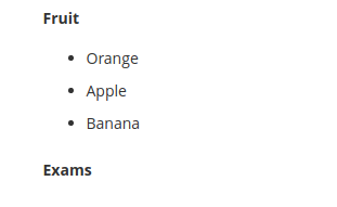
Result
The result is two sections with separate collapsible content.
