Dropdown widget
Use the dropdown widget to display custom content on the storefront.
Widget source file is lib/web/mage/dropdowns.js.
Usages:
HTML markup
1
2
3
4
5
6
7
8
9
10
11
12
13
14
15
16
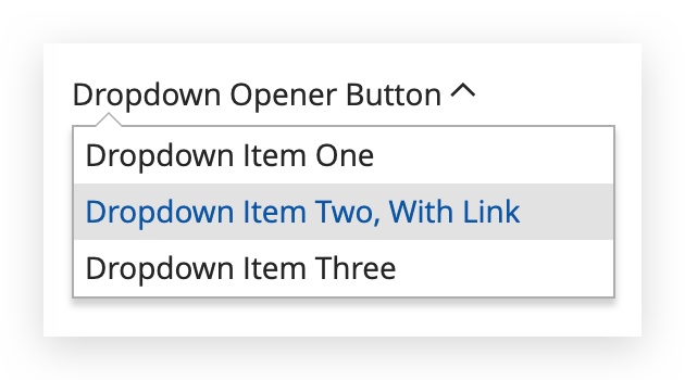
<div class="magento__dropdown-widget">
<span class="action toggle" data-toggle="dropdown" aria-haspopup="true">
<span>Dropdown Opener Button</span>
</span>
<ul class="dropdown-options" data-target="dropdown">
<li>
<span class="item">Dropdown Item One</span>
</li>
<li>
<span class="item"><a href="#">Dropdown Item Two, With Link</a></span>
</li>
<li>
<span class="item">Dropdown Item Three</span>
</li>
</ul>
</div>
Styles
Because the dropdown widget is not formatted by default, use LESS mixin .lib-dropdown() to customize it.
//
//  Simple dropdown
//  ---------------------------------------------

.lib-dropdown(
    @_toggle-selector : ~".action.toggle",
    @_options-selector : ~"ul.dropdown",

    @_dropdown-actions-padding: @dropdown-actions__padding,
    @_dropdown-list-min-width: @dropdown-list__min-width,
    @_dropdown-list-width: @dropdown-list__width,
    @_dropdown-list-height: @dropdown-list__height,
    @_dropdown-list-margin-top: @dropdown-list__margin-top,
    @_dropdown-list-position-top: @dropdown-list__position-top,
    @_dropdown-list-position-bottom: @dropdown-list__position-bottom,
    @_dropdown-list-position-left: @dropdown-list__position-left,
    @_dropdown-list-position-right: @dropdown-list__position-right,
    @_dropdown-list-background: @dropdown-list__background,
    @_dropdown-list-border: @dropdown-list__border,
    @_dropdown-list-pointer: @dropdown-list__pointer,
    @_dropdown-list-pointer-border: @dropdown-list-pointer__border,
    @_dropdown-list-pointer-position: @dropdown-list-pointer__position,
    @_dropdown-list-pointer-position-top: @dropdown-list-pointer__position-top,
    @_dropdown-list-pointer-position-left-right: @dropdown-list-pointer__position-left-right,
    @_dropdown-list-item-border: @dropdown-list-item__border,
    @_dropdown-list-item-padding: @dropdown-list-item__padding,
    @_dropdown-list-item-margin: @dropdown-list-item__margin,
    @_dropdown-list-item-hover: @dropdown-list-item__hover,
    @_dropdown-list-shadow: @dropdown-list__shadow,
    @_dropdown-list-z-index: @dropdown-list__z-index,

    @_dropdown-toggle-icon-content: @dropdown-toggle-icon__content,
    @_dropdown-toggle-active-icon-content: @dropdown-toggle-icon__active__content,

    @_icon-font: @dropdown-toggle-icon__font,
    @_icon-font-size: @dropdown-toggle-icon__font-size,
    @_icon-font-line-height: @dropdown-toggle-icon__font-line-height,
    @_icon-font-color: @dropdown-toggle-icon__font-color,
    @_icon-font-color-hover: @dropdown-toggle-icon__font-color-hover,
    @_icon-font-color-active: @dropdown-toggle-icon__font-color-active,
    @_icon-font-margin: @dropdown-toggle-icon__font-margin,
    @_icon-font-position: @dropdown-toggle-icon__position,
    @_icon-font-vertical-align: @dropdown-toggle-icon__font-vertical-align,
    @_icon-font-text-hide: @dropdown-toggle-icon__text-hide
) {
    // ...
}
Initialize the dropdown widget
The dropdown widget is initialized as described in JavaScript initialization.
Initialize with data-mage-init attribute
1
2
3
4
5
6
7
8
9
<div class="magento__dropdown-widget">
    <span class="action toggle"
          data-toggle="dropdown"
          aria-haspopup="true"
          data-mage-init='{"dropdown":{}}'>
        <span>Dropdown Opener Button</span>
     </span>
     <ul class="dropdown-options" data-target="dropdown" />
</div>
Initialize in .js file with options
1
$('.magento__dropdown-widget').dropdown();
Options
parent
The parent element that initialized the widget. If not specified, the widget locates the element using the .parent() jQuery method.
Type:
- jQuery object
- HTML
- String
Default value: null
autoclose
Determines whether to close the dropdown menu when the user clicks outside of the dropdown scope.
Type: Boolean
Default value: true
btnArrow
(Optional) A jQuery selector that updates the arrow to + or - based on the state of the dropdown.
Type: String
Default value: .arrow
menu
A jQuery selector that represents the dropdown’s menu element. menu must be inside the parent element.
Type: String
Default value: [data-target="dropdown"]
activeClass
Given class is added to the widget element when the menu is visible.
Type: String
Default value: active
Result
The result is a custom select dropdown with custom content as options.